</ripe>
RIPE
UX for sustainable food shopping, validated with a 12-participant study.
12
user evaluation participants
68
Figma prototype screens
6
person research team
SPECIFICATIONS
| ROLE | UX DESIGNER |
|---|---|
| YEAR | 2024 |
| TYPE | MOBILE APP (UX) |
| STATUS | archive |
| STACK | figma · user research · wireframing · prototyping · user testing · storyboarding |
| LINKS | — |
| DELIVERABLES | 9 artifacts · research → hi-fi |
| TOOLS | figma · user research · wireframing · prototyping · user testing · storyboarding |
“People want to shop sustainably, but the gap between intention and accessible action is wide.”
A mobile app designed to make sustainable food shopping intuitive.Seasonal produce calendar, local vendor maps, recipe-driven shopping, and carbon footprint tracking.Validated through 12-participant user evaluation.
 README.TXT — RIPE (3 KB)[full readme →]
== WHAT IS THIS ==
A mobile app designed to make sustainable food shopping intuitive. Seasonal produce calendar, local vendor maps, recipe-driven shopping, and carbon footprint tracking. Validated through 12-participant user evaluation.
== </the problem> ==
People want to shop sustainably, but the gap between intention and accessible action is wide. Seasonal knowledge, local vendor discovery, and carbon impact data are invisible at the moment of purchase, so the sustainable choice stays effortful instead of intuitive.
role & context
6-person university design team. I designed key screens and features, ran user evaluation sessions with 12 participants, and drove the lo-fi → hi-fi iteration cycle.
== </my approach> ==
Our team of 6 researched user barriers to sustainable shopping, developed personas, and merged two initial concepts into one unified design. I designed key screens and features, ran user evaluation sessions with 12 participants, and drove the iteration cycle from lo-fi wireframes to a 68-screen hi-fi Figma prototype with full interaction flows.
== </the story> ==
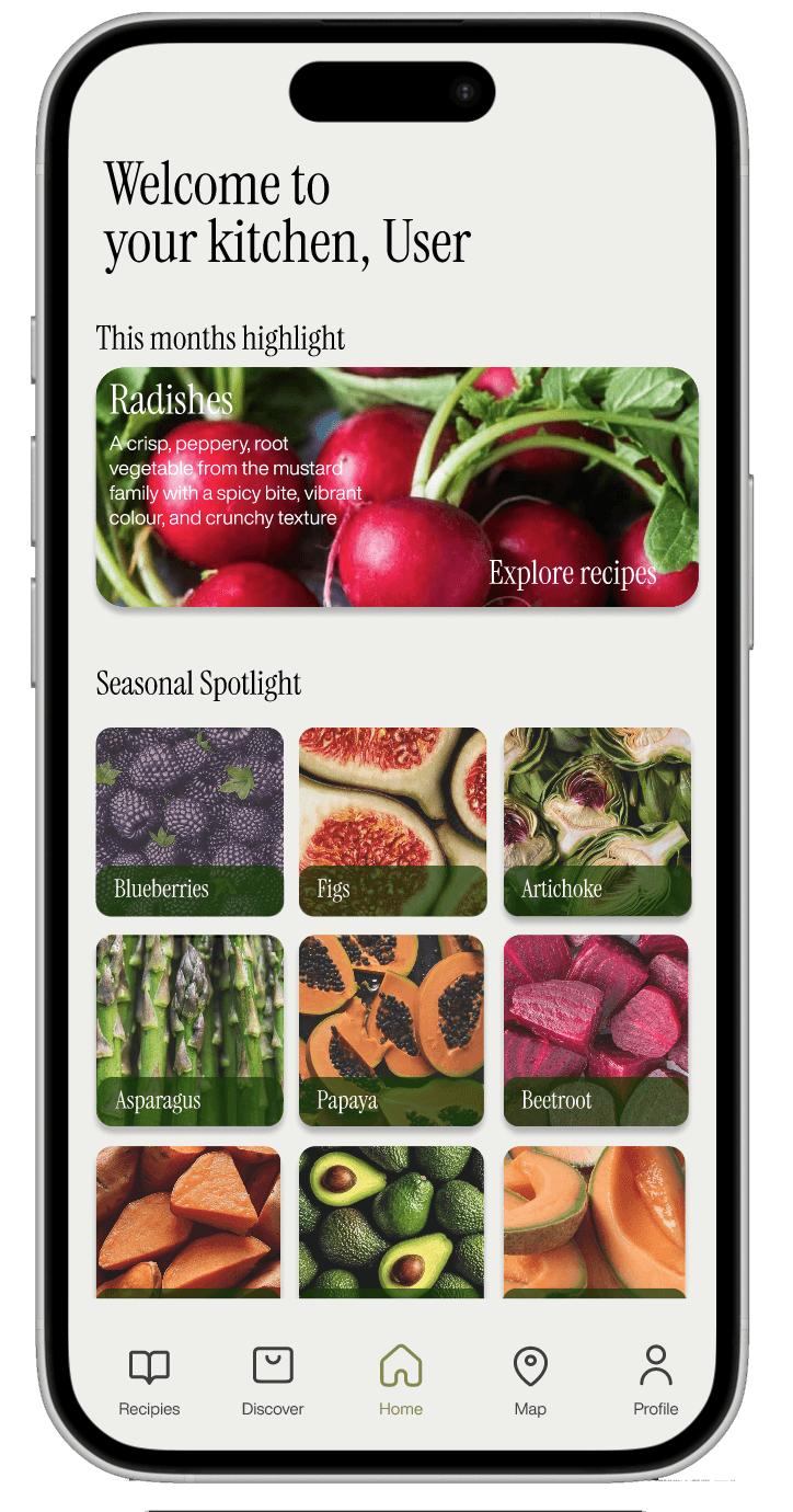
Ripe bridges the gap between sustainable intentions and accessible action. Our team of 6 researched user barriers to sustainable shopping, developed personas, and merged two initial concepts into a unified design. I designed key screens and features, conducted user-based evaluation sessions with 12 participants, and drove iterative refinements from lo-fi wireframes to polished hi-fi mockups. Features include a seasonal calendar, vendor profiles with CO2 footprints, recipe finder, and interactive map for local vendor discovery.
== </architecture> ==
68-screen Figma prototype with full interaction flows. Design precedent research informed every feature - supermarket endcap displays inspired Seasonal Spotlight, Spotify Discover Weekly influenced personalized recommendations. User journey mapping tracked emotional arcs across complete usage scenarios.
== </design decisions> ==
Merging two concepts instead of choosing one
The two initial directions each solved half the problem. Unifying them into a single design was the most impactful decision of the project.
Recipe-first entry point
User testing showed participants arrived looking for meal inspiration. Leading with recipes makes sustainability a natural side benefit rather than an obligation.
Design precedent research
Supermarket endcap displays inspired the Seasonal Spotlight; Spotify's Discover Weekly shaped the personalized recommendations. Every feature traces back to a studied precedent.
Vendor profiles with CO2 footprints
Carbon data attached to real local vendors on an interactive map, turning abstract impact numbers into a concrete shopping decision.
Journey mapping with emotional arcs
User journey maps tracked the emotional arc across complete usage scenarios, not just task completion.
Lo-fi → hi-fi evaluation loop
Evaluation sessions with 12 participants drove iterative refinement from rough wireframes to polished hi-fi mockups.
== </key decisions> ==
DECISION 01
Merging two initial concepts rather than choosing one was the most impactful decision. The recipe-first approach was validated through user testing - participants entered looking for meal inspiration, making sustainability a natural side benefit rather than an obligation.
== </what i learned> ==
Merging two concepts rather than picking a winner was the most impactful call I was part of — the strongest design contained both.
Validate the entry point, not just the features. Testing proved users come for meal inspiration, so sustainability had to ride along rather than lead.
Twelve real participants beat any amount of internal critique — the recipe-first approach only earned its place through user testing.
figma · user research · wireframing · prototyping · user testing · storyboarding
archive